The Context
A virtual office, three languages, zero slack.
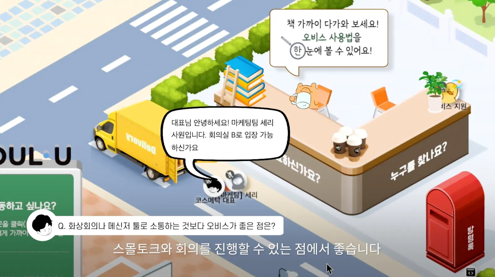
oVice is a virtual office platform where distributed teams work inside shared spaces. The product moved at startup speed, shipping constantly across web surfaces, admin tools, and settings, in English, Japanese, and Korean simultaneously.
Design could not keep pace by hand. Every new screen meant redrawing buttons, guessing spacing, and hoping the Japanese string fit where the English one did. The system existed, version 1.0, but it had fragmented as fast as the product grew.
The Audit
As-is, to-be, and everything drifting in between.
Before designing anything, I audited the existing library against live product screens. Same-purpose components with different anatomy, spacing applied by eye, colors that existed only on certain screens. The audit produced the as-is to-be map that scoped 1.5: not a rebrand, an evolution. Keep what teams already trusted, systematize everything they were improvising.
Drag to compare one representative component. AS-IS / TO-BE Figma frames
Foundations
Tokens first. Everything else is a consumer.
ODS 1.5 is built on a token architecture: color primitives resolving into semantic roles, an 8px spacing scale, radius tokens from tight to full, and defined elevation and shadow styles. Tokens lived as data, versioned and synced, not as styles trapped in one Figma file.
Three scripts, one voice
The type system pairs Poppins for display with Noto Sans for Latin body text and Noto Sans JP for Japanese. Scales, line heights, and truncation rules were tuned so the same component holds its shape in English, Japanese, and Korean.
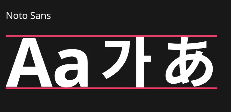
the string changes, the anatomy never shifts
The Library
Around thirty families, documented to the pixel.
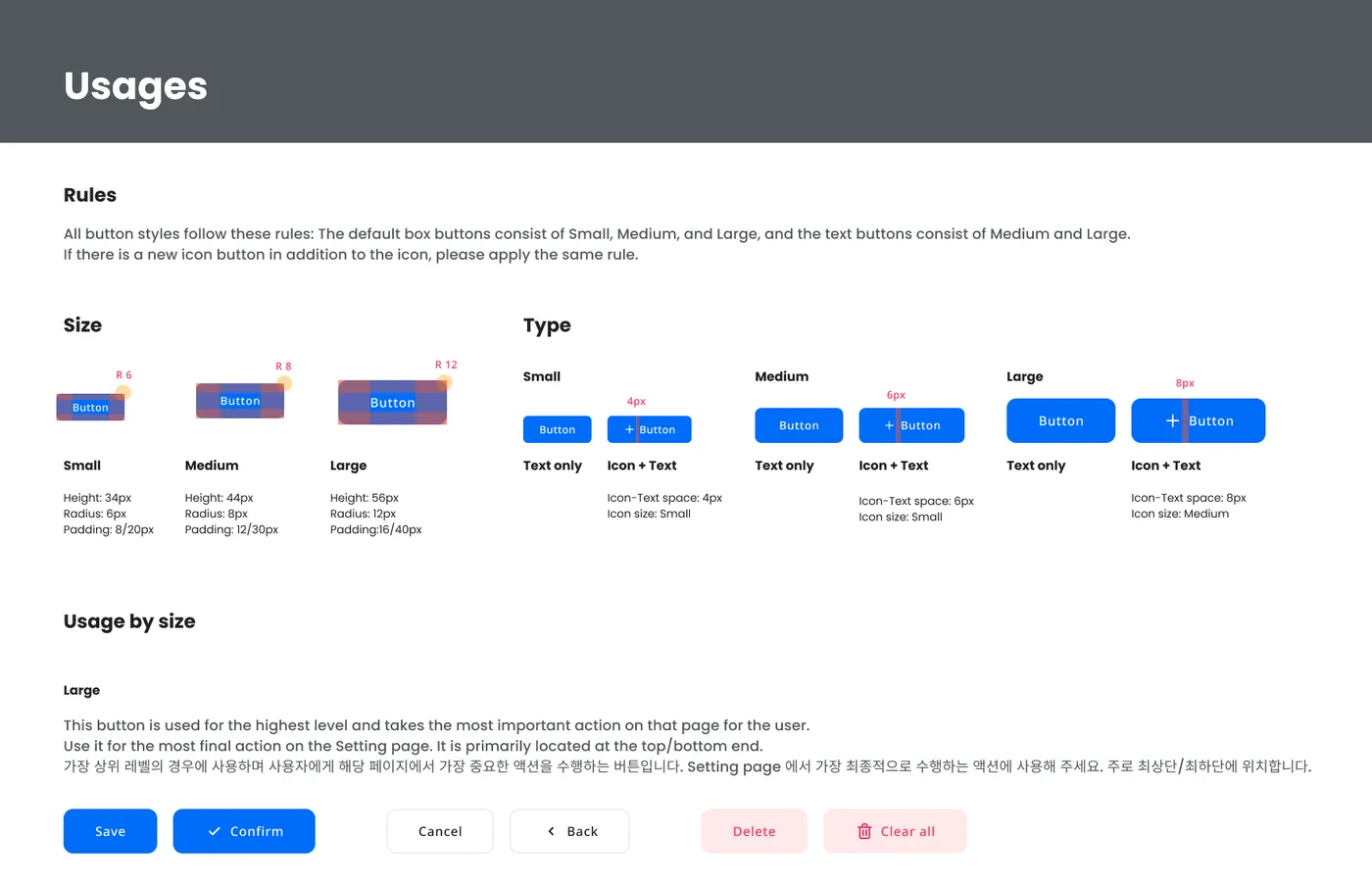
Buttons, inputs, selects, checkboxes, radios, toggles, tabs, tables, pagination, tooltips, chips, toasts, snackbars, modals, alerts, badges, avatars, accordions, sliders, date and time pickers, navigation. Every family defined by anatomy, states, and sizes with exact specs: buttons at 56, 44, and 34px heights, each with its own radius and padding rules.
The heavyweight was the humble table. oVice's admin surfaces run on dense data: user lists, roles and permissions, pending approvals, logs. The table family, cells, headers, rows, and their states, became the most-used component in the system and the one that earned the most documentation.
Iconography
Seven sets, one pipeline.
The system carries seven icon sets: a core basic set, Material Symbols, emoji, brand logos, OS-specific glyphs, and media controls. Material Symbols were wired with their variable axes, fill, weight, grade, and optical size, exposed as component properties, so any icon could match any context without redraws.
Documentation
A system nobody can read is just a sticker sheet.
Every component family ships with anatomy, states, and usage pages: when to use a single tab versus multiple, how a modal picker differs from a modal delete, how badges attach to avatars and icons. Docs were written for the people actually consuming them, which at oVice meant bilingual notes so no designer or engineer had to work in their second language to use the system correctly.
Adoption
The proof: real screens rebuilt on the system.
ODS 1.5 was applied first to oVice's Space Settings surfaces: overview, privacy, domain, roles and permissions, member approvals. Screens assembled from the library instead of drawn from scratch, with tokens flowing through every fill, gap, and corner. Design moved at the speed the product demanded, and consistency stopped depending on memory.
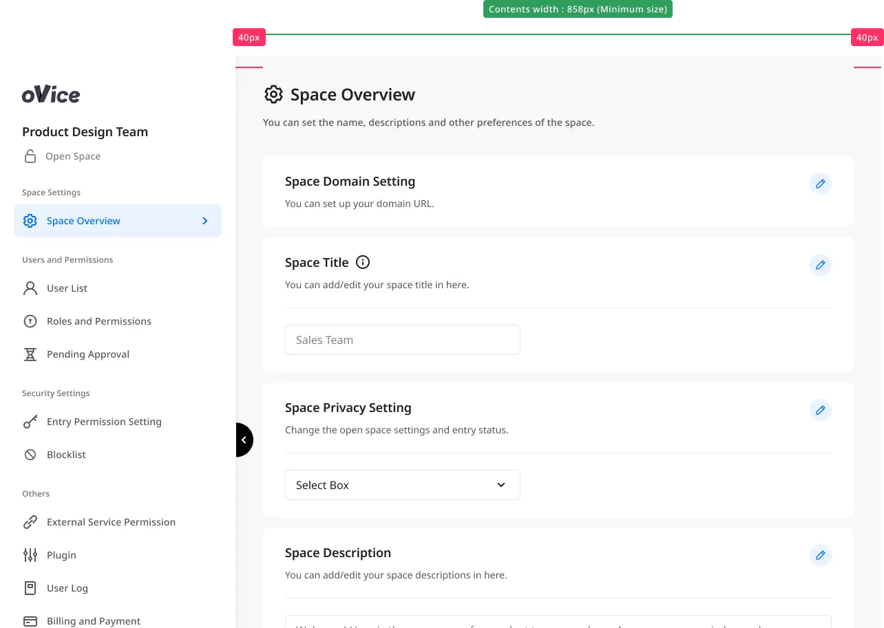 LeftMenuPageHeaderSectionCardTextInputSelectBoxSectionCard
Space Overview, assembled entirely from library components.
Reflection
Systems are products. Startups teach you fast.
Building ODS at a startup meant there was no systems team, no six-month runway, and no tolerance for a library that slowed anyone down. The system had to pay for itself immediately, which forced ruthless prioritization: tokens and tables before theory, documentation before decoration.
That discipline carried forward. The token thinking, accessibility rigor, and documentation habits from ODS became the foundation for my later design system work at Huntington National Bank, at enterprise scale. This is where I learned that a design system succeeds the day someone ships a screen without asking you anything.