The Audit
We stress-tested the platform.
Search cracked first.
During a platform-wide audit, we tested the product end to end, hunting for surfaces with the most room to improve. Five areas surfaced as the strongest opportunities: IA and taxonomy, linear TV, search, sports, and unified program info. Search stood out. It touched every user, every session, and it was quietly failing.
The Problem
Four gaps. All quietly costing viewers.
No action leads.
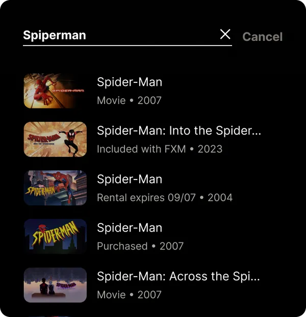
Results showed titles but gave viewers nothing to do next. Every tap became a detour.
Uncontextualized results.
No object type, no year, no signal. Viewers could not tell what they were looking at.
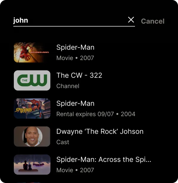
Exact match only.
One typo, one loose phrase, and the catalogue disappeared. Search punished natural language.
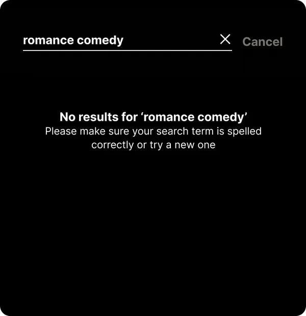
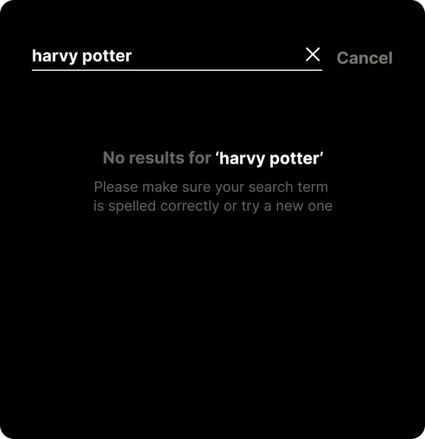
Dead ends.
A failed query returned nothing at all. Zero results meant a lost session, not a redirect.
Discovery
Three methods, one finding:
intent was invisible.
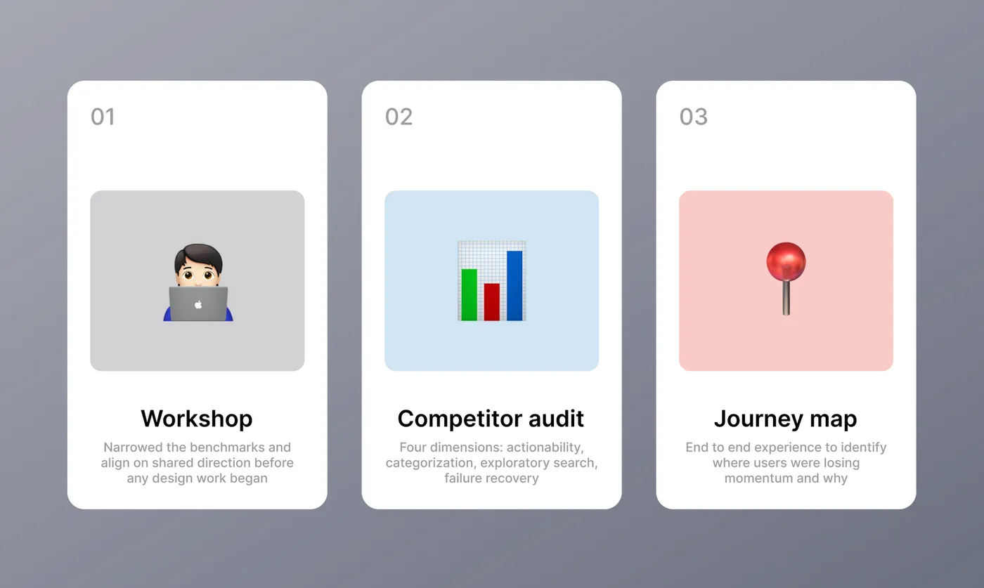
A workshop with stakeholders, a competitor audit, and journey mapping all pointed at the same gap. Viewers arrive with intent, a mood, a genre, half a title, but the system only rewarded people who already knew exactly what they wanted. Everyone else got a flat list or nothing.
One more thing surfaced early: every recommendation would live or die by technical feasibility, platform constraints, and business priorities.
The Proposal
Five UX moves to make search feel like magic.
Surface entitlement in results.
Viewers were dropping off after tapping into Program Info only to find the title was not in their plan. Exposing availability directly in results, live, included, or rent, lets people act immediately instead of discovering the bad news two screens deep.
Redesign the empty state around intent.
The un-interacted search page was an untapped surface. Instead of mirroring the homepage, we rebuilt it around how people actually arrive. Help Me Decide anchors the top, genre cards invite browsing. Search becomes discovery, not just lookup.
Two-tier filtering.
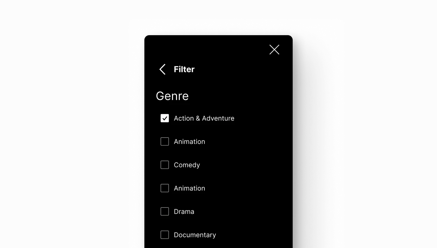
A flat list is hard to scan. Primary pills filter by object type instantly: movies, series, episodes, channels, networks, cast and crew. A secondary drawer refines by genre, live status, and availability without cluttering results.
Exploratory search.
Not every viewer comes in with a title in mind. Supporting mood, genre, and intent-based queries opens the catalogue to people who are browsing, not hunting.
Failure recovery.
A dead end should not mean a lost viewer. When a query fails, surface similar titles and popular-in-genre rails, turning a zero-result state into a new discovery path instead of an exit.
Reality Check
Recommendation met reality.
Here is what changed.
Through continuous product owner syncs, every recommendation was pressure-tested against feasibility, platform constraints, and business priorities. Some shipped intact. Some adapted. Some did not survive.
Search page
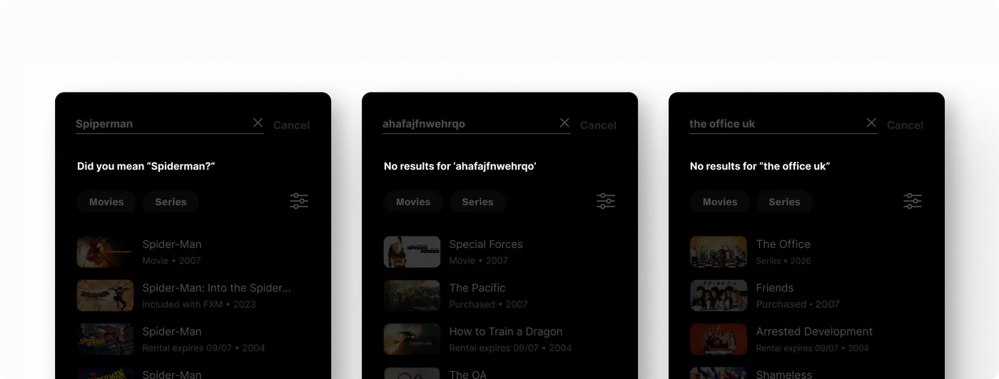
Help Me Decide stays as the intent entry point. Genre cards were replaced with dynamic rails: personalized recommendations, special event spotlights, and curated collections. Better than the original idea.
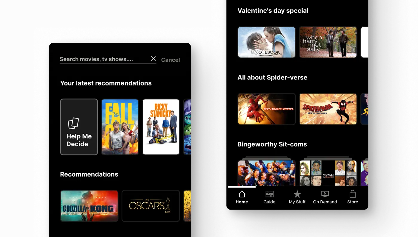
Metadata
Kept lean to protect performance. Each result surfaces object type and release year. Language tagging follows precise logic driven by Gracenote licensing: English-only content shows no tag, secondary-language content is tagged, dual-language content surfaces only the secondary tag. Entitlement labels were scoped out; the extra data sourcing introduced fixed delay that was not worth the tradeoff.
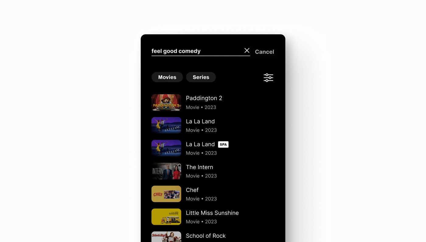
Filters
The secondary drawer narrows to genre only. Entitlement and live status could not be reliably pulled at the search level, so availability now lives where it can be accurate: Program Info. Accuracy beat completeness.
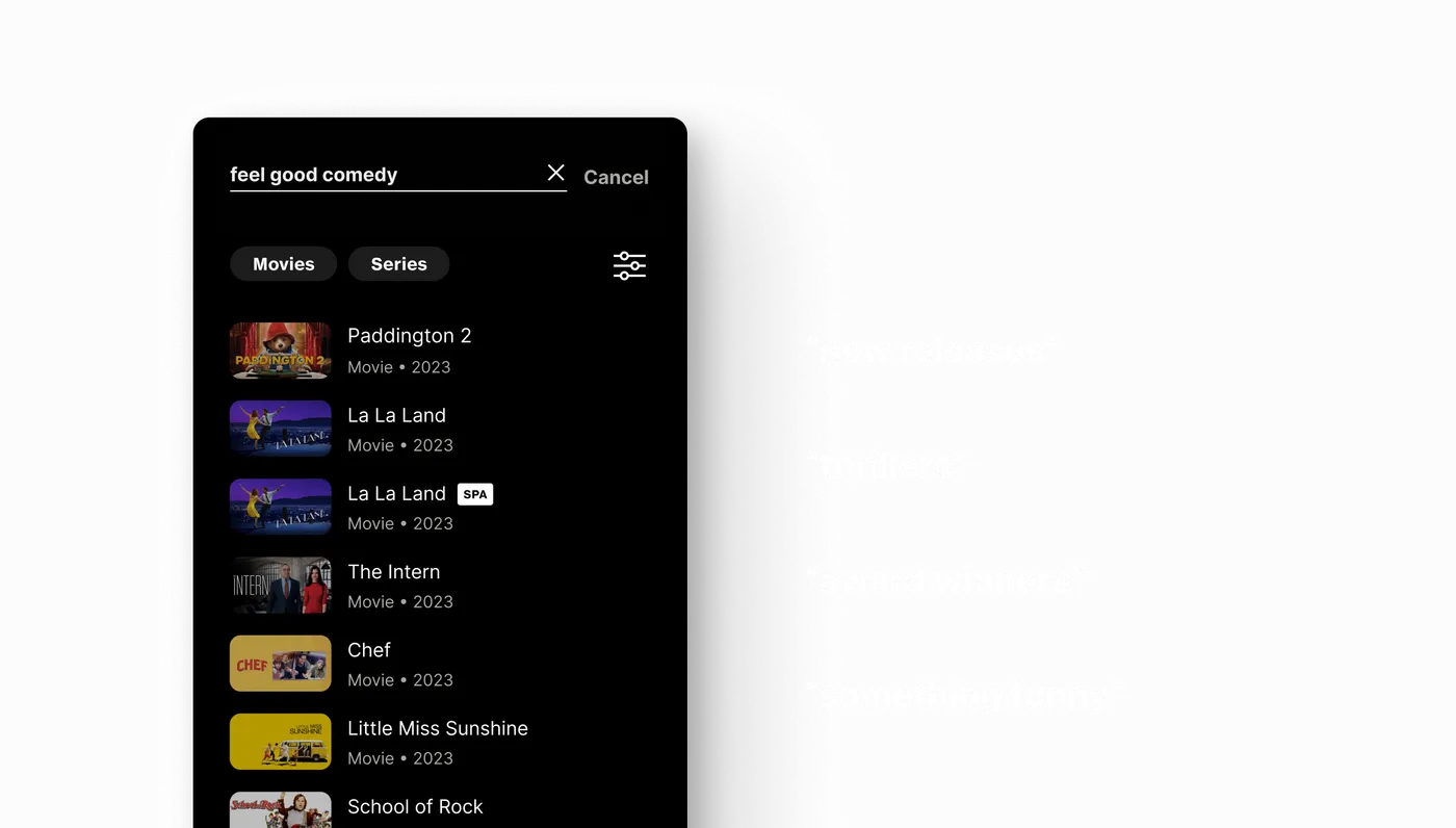
Exploratory search
Mood, genre, and intent-based queries made it through intact. The catalogue opens up.
Failure recovery
Zero-result states now redirect into similar and popular rails. A dead end becomes a detour.
Good design means nothing without buy-in. The version that ships is the version that survives contact with the platform.
What's Next
In development. The metrics are waiting.
Once live, we stress-test the experience against real usage. Quantitative data drives the next iteration, informing how we scale the system and refine what is working. The three numbers we are watching are already defined.
Drop-off rate
From result to playback. Where viewers still fall out of the funnel.
Search-to-playback conversion
The true success metric. Did the query end in something watched.
Zero-result frequency
How often recovery gets tested, and whether the detour holds.
Reflection
The best idea is the one that survives QA.
This project taught me to design in two registers at once: the ideal version that shows what search could be, and the shippable version that respects Gracenote logic, data latency, and platform reality. Holding both without letting either collapse is the actual job.
When version one meets real users, the data will tell us where the next fight is. I already have a guess: entitlement in results is an idea worth bringing back.