The Brief
Make Fios compete with the platforms people love.
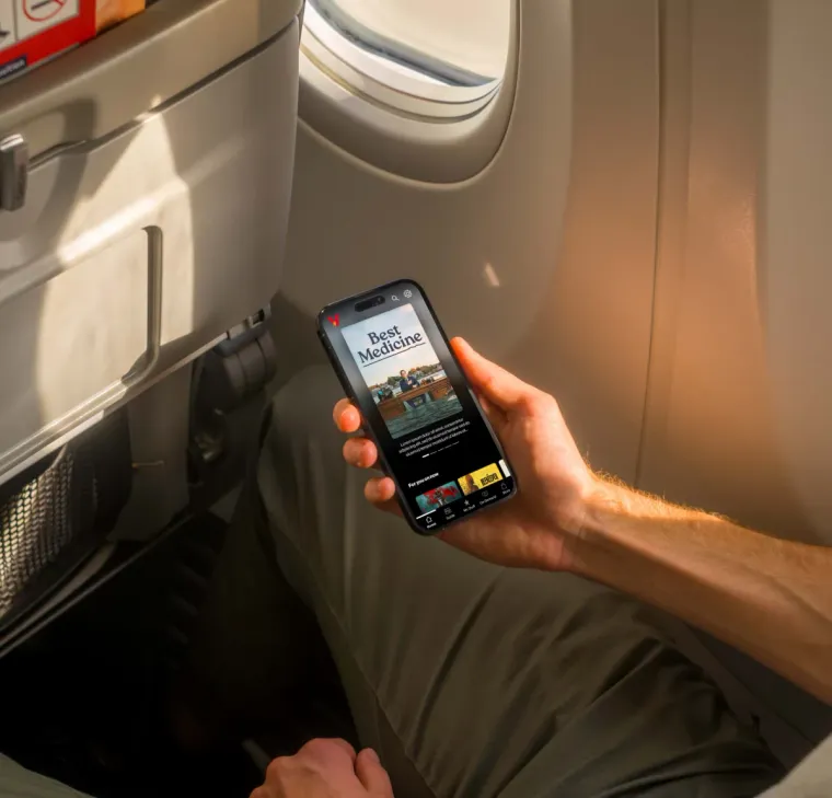
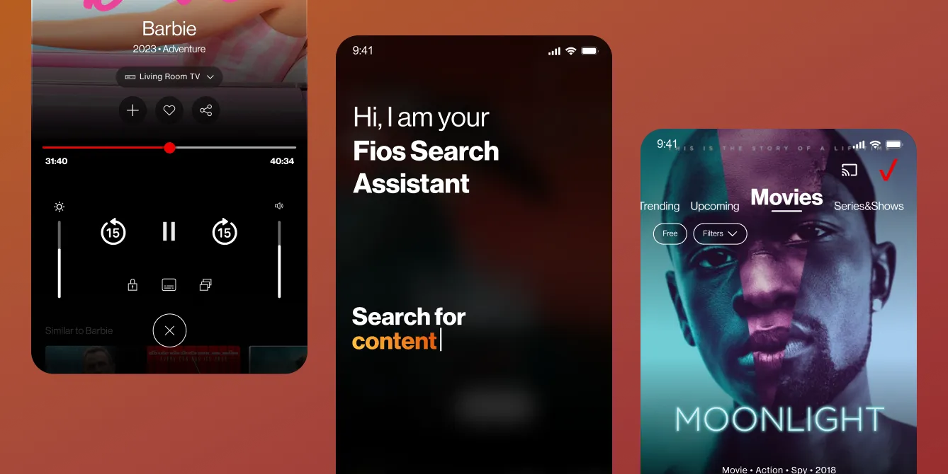
Fios TV Mobile was functional but falling behind the experiences setting user expectations: Netflix, Disney+, YouTube TV. The mandate was to envision the app that positions Verizon alongside them. Refine what exists, integrate what users have been asking for, and design the system that lets the product evolve without breaking.
Research
A benchmark and gap analysis against everyone.
We analyzed generations of Verizon user testing, ran an internal workshop, and benchmarked the biggest platforms in streaming. Not to copy them, but to map the gaps: where Fios lagged, where it matched, and where it could leap. The comparison set was every app on a user's home screen, because that is who Fios is measured against.

Discovery is layered.
Leading platforms stack multiple discovery mechanisms so every kind of intent finds a path to content.
Variety is the destination.
Linear plus on-demand in one catalogue makes a platform the default, not a detour.
Streamlining never stops.
The best experiences anticipate behavior and iterate relentlessly on friction.
The Synthesis
We designed around mindsets, not features.
The research kept sorting into three ways people show up to a TV app. Sometimes you arrive to connect with what you love. Sometimes you arrive hunting for something new. Sometimes you just want to watch, instantly and without friction. Those three mindsets became the three epics that structure everything that follows.
Part 1 · The Foundation
Simplify the hierarchy before anything else.
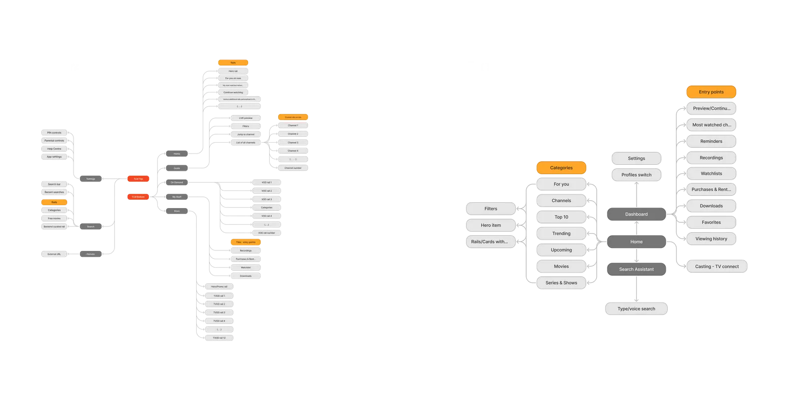
Part 1 rebuilt the structure. The previous TLM-based navigation offered consistent layouts but introduced small design variations that added friction. By simplifying the hierarchy and prioritizing personalized content, we created a consolidated, user-centered architecture ready to support every epic layered on top of it.
Epic 01 · The Returning Viewer
Beyond numbers. Crafting the holistic view.
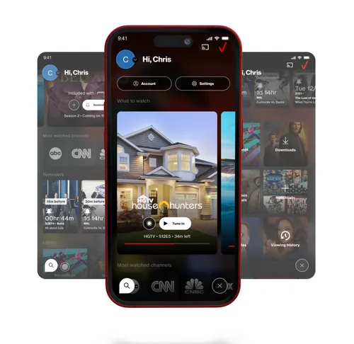
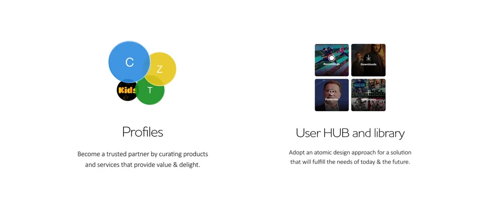
Engagement starts with the app knowing who is watching. Personalized profiles, tailored recommendations, What to Watch, and an enhanced Library turn a utility into a habit, fostering connection through experiences that feel tuned to each household member.
Epic 02 · The Searching Viewer
One catalogue. Smarter ways in.
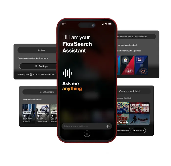
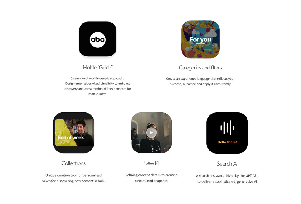
The deepest epic of the three. We unified the content catalogue, introduced Collections for grouped content, redesigned the Content Details page, and added AI-driven search for intuitive, forgiving results. Every path into content got shorter, and every dead end got an exit.
Epic 03 · The Watching Viewer
From tap to screen without friction.
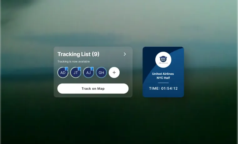
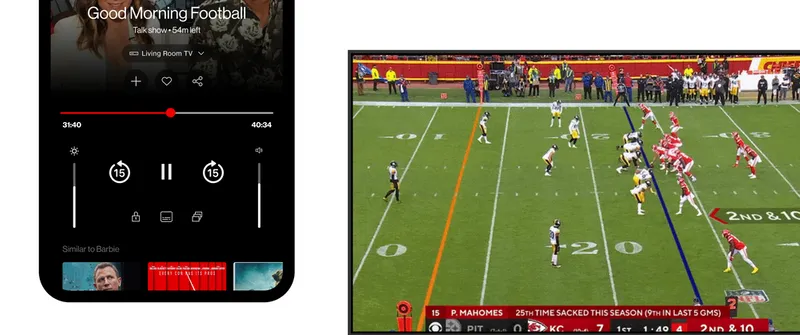
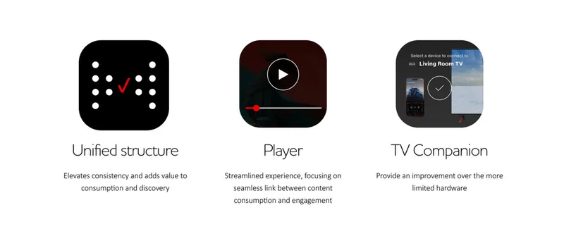
We streamlined the core viewing experience: intuitive navigation, an enhanced Player, and TV Casting for effortless control. A new TV Companion feature bridges mobile and television, so the phone becomes a remote, a guide, and a second screen. Live sports got special attention, where a second of friction costs the moment.
Reflection
What a north star is actually for.
Concept work is easy to dismiss as unconstrained dreaming. This one was structured against it: every mindset was pressure-tested against where the platform genuinely needed to go, and the work was packaged as discrete epics, designed to be picked up one at a time whenever production ramps, rather than demanding a big-bang rebuild.
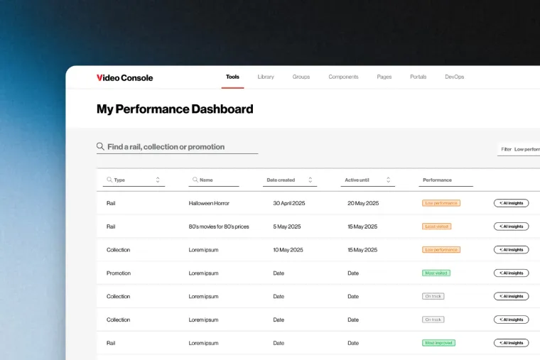
The proof is what came after. The discovery thinking and AI search explorations seeded the shipped Verizon Search redesign, and the systems mindset carried into the Console work. A vision earns its place when the production roadmap keeps borrowing from it.